







The website: one story for two businesses
The stakeholders had already tried a freelancer and weren't satisfied with the result. They asked me to take it on, with two weeks to deliver.
The harder work was the story, not the screens. I had to present a lab-services business and a software product side by side without reading as two companies. Client work had to stay anonymous, and the site had to serve all the three audiences.
Animation by Nikita Skopych
Animation by Nikita Skopych
The brand: a mark that tells the story
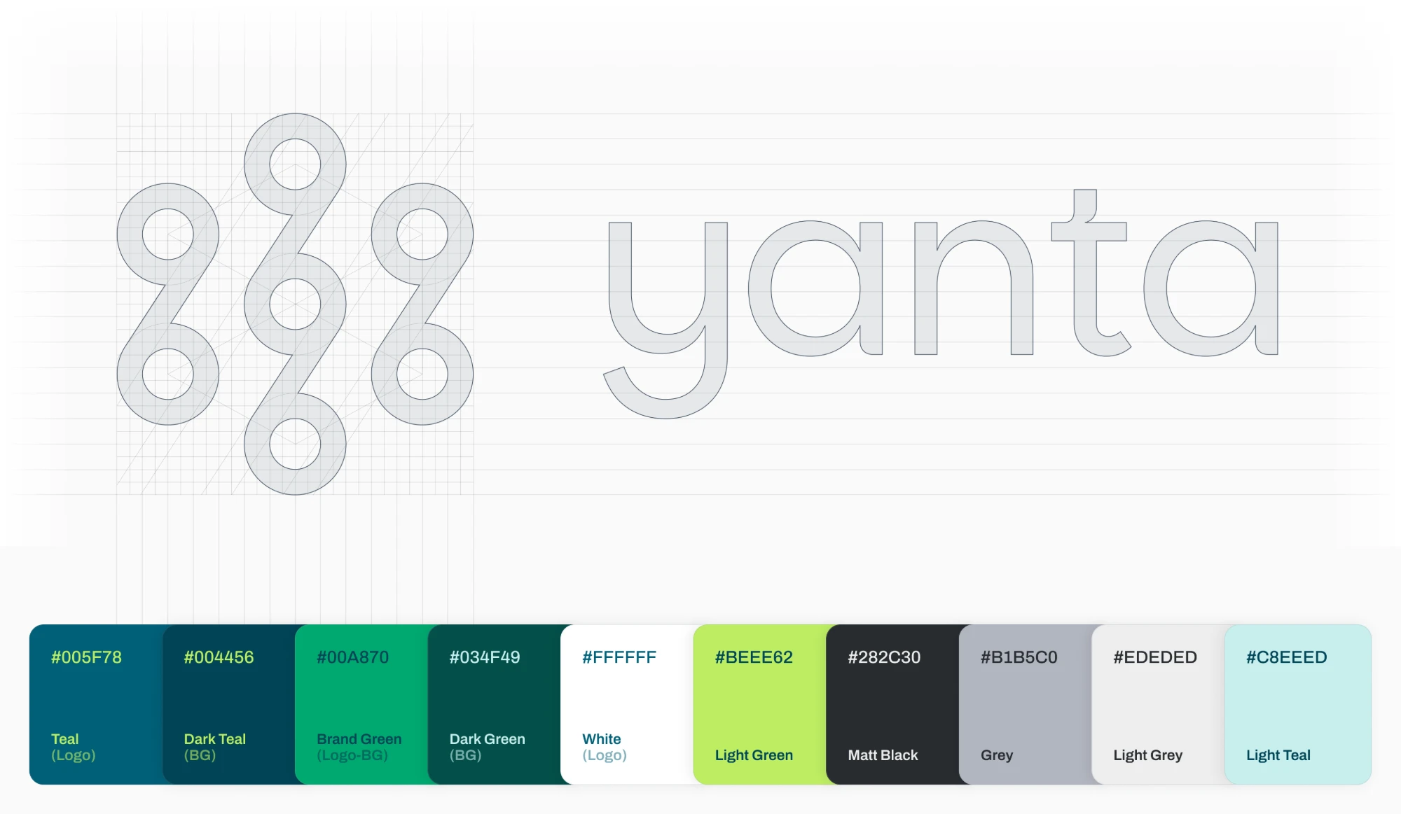
My first move was a rule, not a sketch: any direction not recognizable in a 0.5 cm square was out. A digital product meets its mark first as an app icon and a favicon.
The concept came from the product's purpose. Bioprocessing science is highly evolved, but the systems holding it together rarely are, so information fragments between the run and the result. Yanta is built to close that gap.
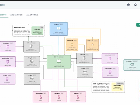
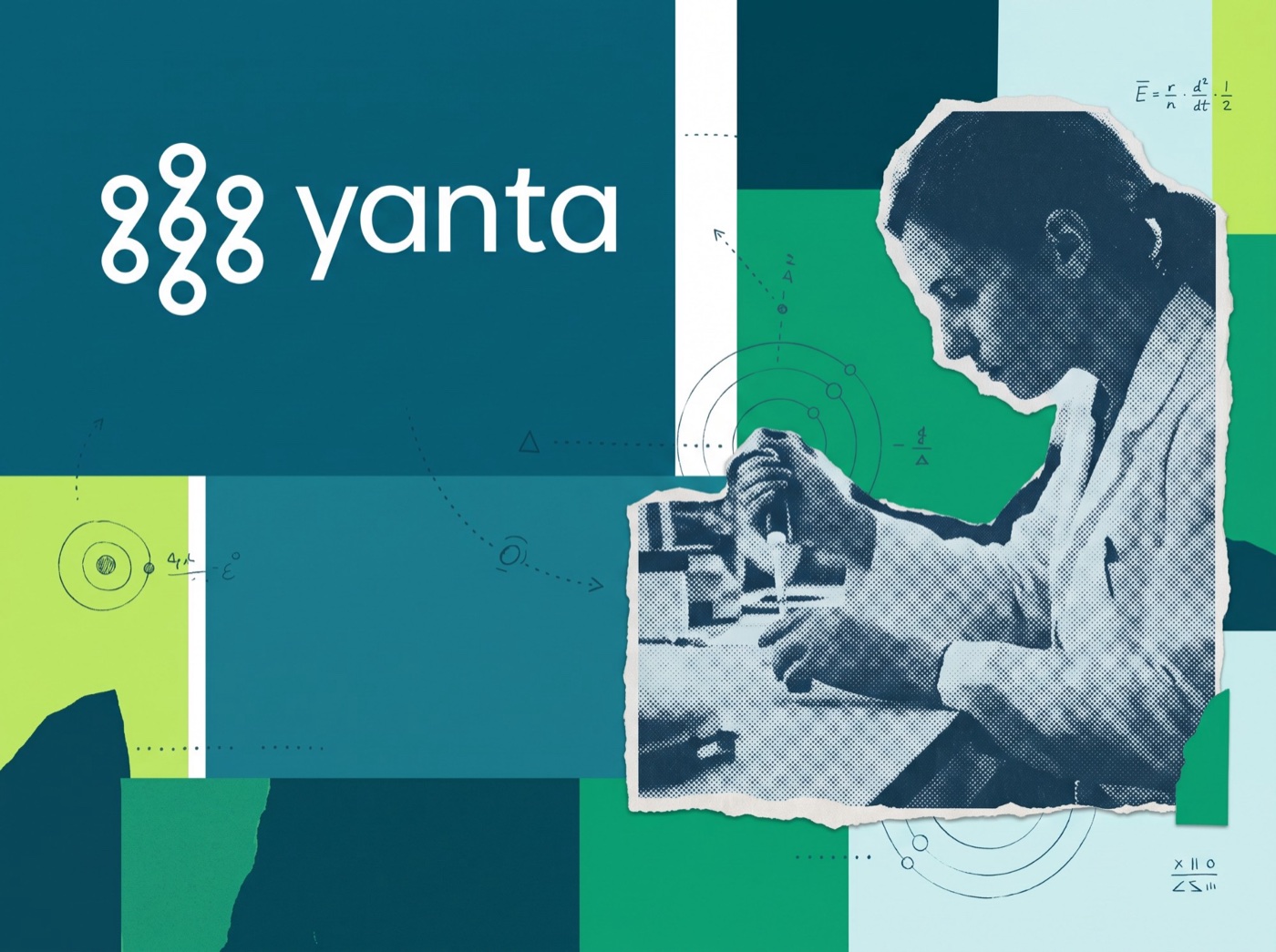
The mark carries that promise: three pillars — Execution, Data Management and Process Intelligence — bound by one continuous flow. Like a centrifuge resolving a mixture into its components, Yanta brings the layers of a process into clarity.

The design system: one source of truth
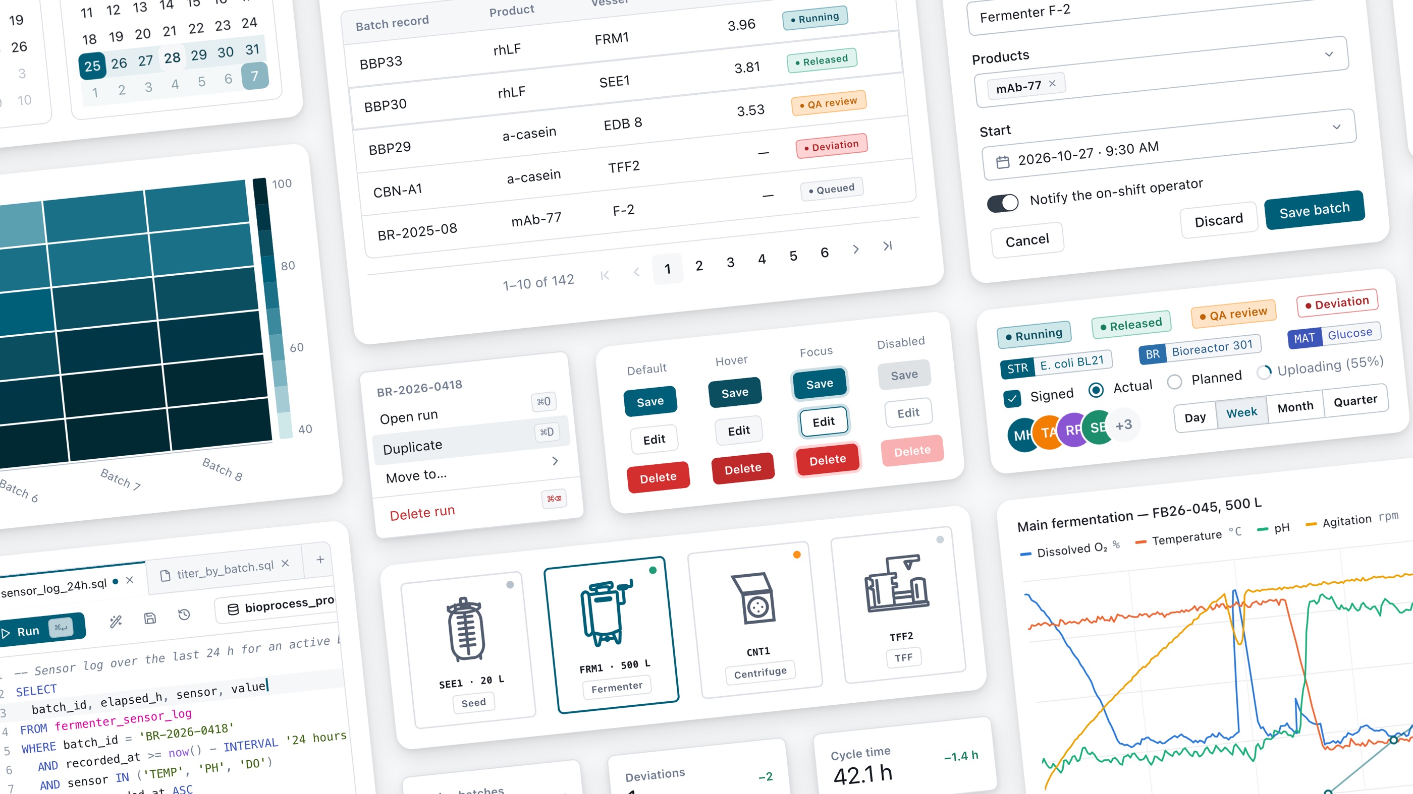
I started the foundations in Figma, but each component took significant time to build, stretching an already tight timeline. In parallel, I tested Claude Code and Cursor with the Figma MCP server, and my first attempt to build with AI failed. I began with a complex component, a SQL editor. After two 16-hour sessions nothing was shippable: without context, the AI kept generating its own hard-coded primitives and tokens instead of using ours.
What was missing was the system's context; access to the Figma design system file alone wasn't enough. So I rebuilt the workflow in three layers:
- Context. A design.md file that gives Claude the system's rules before it touches a layout.
- A build template. A reusable Claude Code prompt that enforces token discipline, reuse before recreation, showcase grids for review, and an audit that must report zero hard-coded fills.
- A component template. A second prompt that builds each component from shadcn/ui, using the system's own primitives and tokens.
With these in place, the picture changed completely. For example, a complete tooltip component, with every variant and state, took 26 minutes, first pass. That pace is what made the full component set possible in three weeks.
What I'd carry forward
- Context beats capability. The AI tools only became useful once they knew the system's rules. I now start with context and foundations, not the hardest component.
- Judgment stays with me. AI does the volume work; I decide what should exist and what ships. Checks catch hard-coded values and recreated primitives, but only judgment catches a screen that passes every check and is still wrong for the task.
- Prototype in the real system. With the design system in code, I skip wireframes, not exploration. Alternative directions are explored directly in high fidelity with real components, so what gets approved is what gets built.
- Speed is a consistency decision. Every week of transition meant features built on two systems. Moving fast was how I protected quality.